Wednesday, 30 January 2013

Outer box


This is a small 3D model of the outer box for my possible final Idea. It is a basic rectangular net longer on two sides than the other. The idea it meant to represent a barbie box and this is what one of those looks like.  It has a window that I put a thin piece OHT behind. Eventually the final design will have a fold out layout of a room inside with a cutout of myself. 

The practice net overall worked out well and the real net will be 10 times the size of this prototype.


Side view 


Front view

Package Development

I have started to develop my final package design. I am going for a basic prism design with a window. This package will then fall out into a flat circle or square and present a pop-out layout. It is quite difficult to design this package in an easy way so its not too complicated for the user/audience to understand. Below are a few 3D models I have tried and designed myself in order to find a suitable net for the packaging.


Here is one model and I used a circle shape and tried folding it into a prism. I feel that this example has too many folds in it and wouldn't be very aesthetically pleasing as an audience would see the folds before they see the designs.


This is the net I drew out to attempt folding. This is just a practice and I wasn't too 
sure what the outcome would be. I began to just draw the shape of the net itself so I knew it would fit into the box. The next step would be the folding. 


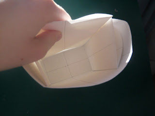
This is the circle box folded into the prism. I feel that this doesn't fold very well as the folds are in random places. The circle does not fold well.


This inside of the net.


The back of that same net. This shape doesn't fold and hold its shape, it needed my hand to keep it closed. If I wanted to use this net again I would need to put it inside another prism and it would be pulled out by the user/audience.


The net with fold lines. This design is better than the top one as there less folds in it, however the folds aren't int he correct places to enable a neat placing inside the net itself.


Another attempt to designing a box that will fold out flat by using folds at the side that could press together when inside the package and then fold out flat.


Another angle of the net above.

After doing these nets I feel I have got a better idea of how to make my net that folds out but with these trial and errors I have found that I need to do more trials to find a good design that works for both me and the user/audience.

"Are you a cat or a dog person?"

Yesterday was the laser cutter session where we made the bottles out of paper. I have used a laser cutter at A-level and used acrylic rather than paper and card. It has made me realise I can have any design whether its  very detailed and intricate or not and the laser cutter will be able to cut it out. 


The laser cutter at work...


The bottle made with thick card.


Here is a dogs silhouette that the technician made out of acrylic to show the different materials that the laser cutter can cut and also how it etches into the material.  This has made me think about my final design and how I can etch something onto the card to create a unique design that looks very detailed.


Playing around

Here is an example of one of my logo designs done in Illustrator. It us a very simple design but I wanted to experiment and see what it looked like on a screen.


Logo's

Here are some logo's I have designed using a variety of different shapes to represent different meanings. i will annotate in my sketch book to show what I was thinking when I designed each one. I will now do another survey and ask for peoples favourites, add colour where appropriate to the chosen favourites.


Primary Research

I decided to carry out some primary research to help me in my designs and logo designs. I figured that this would influence my designs in a good way and help me to design for my audience better. I began by e-mailing Mother an advertising agency in London. This agency is possibly someone I would like to work for after my degree and who I am aiming my package at. Unfortunately Mother never replied to my e-mail. I assume that they are far too busy for things like that. Instead I asked the people around me. I drew up a questionnaire that asked them about advertisements and logo's today and what they expect of these when they see them.
The questions I asked are below:
(The answers I gathered are below. I asked 5 people.) 

1. What do you expect to see when you see a still advertisement? (please state 3)
  • Bright colours                                                   
  • Catchy slogan
  • Bold text that stands out

  • Creativity 
  • Innovation
  • Informative words

  • Colourful
  • Images
  • Catchy words

  • Pictures
  • eye-catching slogan
  • stands out

  • original 
  • fresh
  • thought-provoking 

2. What do you expect to see when you see a logo? (Please state 3)

  • Simplicity 
  • minimal words
  • memorable 

  • memorable
  • colourful
  • original

  • eye-catching 
  • creative
  • memorable 

  • creative 
  • understandable 
  • original

  • Meaningful
  • Contains a message 
  • Represents company well
3. 3 things about me as a designer or person?

  • Strive for perfection 
  • approachable 
  • person 

  • Creative 
  • Fun
  • Genuine 

  • Original
  • Bubbly 
  • Colourful

  • Ambitious
  • Level-headed
  • Fun 

  • Sensible 
  • Calm
  • Organised 


I will use of of these answers to my advantage when designing my logo. I can incorporate these useful perspectives to develop my innovative techniques to further benefit my logo and packaging design. 

Workshop Logo's

These are the logo's I created during the workshop on Friday. The use of arrows is to represent the import and export company. I used the cut out letters and over lapped them to try and create the meaning of solidarity. With others I split one letter up and created another letter with the dead space, I then put the logo in a circle to show wholeness.

3D experimentation


I have started to experiment with the different shapes of my initials. I did this with paper and tried to shape it so that it represented the letter forms.


Monday, 28 January 2013

unique


This is an example of some extensive paper sculpting.  This artist is called Bert Simmons. This is his way of doing a portrait of someone. The combination of his imagination and the use of digital techniques creates these amazing pieces.


'According to the artist, this form of 3D art is a time consuming process, involving face scanning and the assembly of paper pieces to give the sculpture a realistic appearance.'


Origami


I found this image of a camera made from folding paper. I thought it was quite interesting as my favorite part of design is visual things and communication. I figured that this would represent this really well.

This could also contain something and would easily be able to have other designs on the exterior.

Initial ideas


Here is another initial idea. It is based on a sphere that stands on its own. the legs on the sphere are supposed to represent the fact that as a designer I can work as a team but can also stand on my own. The sphere can also represent that I am a well rounded designer. The sphere can be opened up and with further development this could hold a design of mine or information about me.

Below is some of of the development 3D models that I made to try and experiment with the shape and form of it. 


Initial ideas

Here I have made one of my initial ideas. It is based on a basic cube net but with one of the sides cut out. This side is then filled with a roll of paper, almost like a receipt machine, the user can pull out the paper and it will have designs of mine on or  illustrations, possibly just information about myself. 
This way the packaging is interactive and the user will have to interact with it to find out what it is.  


My packaging

I am now beginning to think about what my final idea could be for my packaging. I am going to start experimenting with paper to come up with some ideas.

Curated-by

These are the leaflets and goody bags that came from Curated by that I attended on Saturday.

I found all of the speakers particularly inspiring especially Jack Schulze and Erik Kessels.


One of Kessel's most inspiring pieces was the 9500 photos that he put in one room. These photo's were the amount of photo's that had been taken in one day and had come from Flickr. It showed how much of our personal lives we can show in just a few images that we uploaded one day.

"You see all the babies that were born that day and how many family events went on that day." Eric Kessel

Below is a link that shows an article that was written about this artist:

Kessel's link

Image overload: A young boy sits back and enjoys a single picture he chose out of the one million images he could have picked from at Eric Kessels' exhibition in Amsterdam

Pop-up


Here is another example of how I experimented further with pop-up. I only used a basic technique and used a random shape to show what I could possibly do with this mechanism.

Friday, 25 January 2013

Experimentation


As I said from the last post I am going to explore the pop up art. Here I have simply experimented with the technique of how a pop-up  book is made. From here I can now add other shapes and more complicated forms.


Pop-up art


I began to look at some pop-up art to try to stimulate my thinking towards initial ideas and possibly a final outcome. I came across some extremely detailed art in which the artist has started with a magazine or book, cut shapes out and laid them out in a pop-up form. An example is below.


The work in this piece has incredible detail- this then led me to think about the laser cutter and what opportunities that could bring. Making a pop-up book of my own would be possible as the intricate shapes I want that are too detailed to do by hand can be done on the laser cutter. I am going to try this technique and see what ideas it brings to mind.

Thursday, 24 January 2013

Advertising Big Time


When I think about what I want to after my degree I always think of myself designing the huge adverts you see in Leicester Square..I can always dream. I thought about how these are designed and how I can connect this to the packaging based on myself. Could this represent me somehow?


The size of these adverts then got me thinking, is there any limit to the     packaging that I have to design and is there a size limit?

This got me thinking about what something of a large scale could say about me as a designer. There's no limits for me as a designer or I think big.


Thinking inside the box...


I often think to myself, when will technology expand so much that the images on our packaging are interactive and moving? Or when smart paper makes it onto the carton of orange juice we all drink in the morning?

Below is a link to an article I've been reading about Kellogg's and how they started to look into their packaging being interactive. With the growing number of people having smart phones these days you see interactive icons on almost everything you see, in magazines, packaging, billboards and so on..

This is just a mere example of how it all began. It got me thinking, if I had the technology, could I make my own brand and packaging have a link on it, taking the viewer/audience somewhere that would further sell myself as a graphic designer, possibly taking them to my blog or website?

Kellogg's interactive packaging link.

Richard Sweeney


Olympic Horses

Whilst researching other artists and designers I stumbled across a paper sculpture named Richard Sweeney. His 3D designs create interesting shadows and incredible detail. Sweeney works with small scale sculptures but also had worked with exhibitions and festivals in a much larger scale. The outcomes are fascinating and almost look too precise and perfect to be hand-made. Below is an example of a festival he worked with in Lincoln.


These horses are life size and convey perfect detail and create shadows in all the right places. 


More examples include much smaller scale designs. below are some examples that have the chance to inspire my packaging work. 


Wednesday, 23 January 2013

Logo Fascination


Something that always fascinated me about logo's was the hidden meaning within them. If you don't have a designers eye its often difficult to even read the signs and see through the design.

I found a few logo's where I couldn't see the hidden image or meaning at first but then your eye changes and you can somehow understand the message the company is trying to send.


To the left is the Toblerone logo. At first you just see a mountain and some type but when you look closely there is in fact the silhouette of a bear in its hind legs.

The bear is the symbol of Berne in Switzerland where Toblerone is produced.

Each hidden meaning tells a story that unveils the facts about the company/party.


Another logo with hidden meaning is Amazon. The arrow goes from A-Z suggesting that they sell everything from A-Z. The arrow also doubles as a smiley face to suggest satisfied customers.


 This Tour de France logo has a hidden image within it. Within the letters 'OUR' there is the image of a cyclist, representing exactly what the logo is trying to sell or show the audience.

If a person didn't know what this event is they would be given a clue in the logo. Helping the audience to understand what they are looking at.